Copy of Worry Less About Your Website
and Free Up More Time for your clients
Northwoods has been developing high-performing websites and creating peace of (digital) mind for more than 20 years. Our clients rely on our honest advice and guidance to help their businesses thrive.
Get a Free WordPress Evaluation
Request a free, 20-minute, no obligation call to find out how we can create peace of (digital) mind for you and your team.
"*" indicates required fields

We put our trust in the Northwoods team to create a digital presence that’s visually compelling, effective, and true to our brand, and they delivered. Our new site is easy to manage and provides a great user experience for both current and prospective customers. Northwoods offered honest, expert guidance throughout the redesign and has truly been our digital best friend.
- Jodi Rummelhart, Director of Business Development
Client Stories
North Shore Healthcare
North Shore Healthcare has over seventy facilities that offer long-term skilled nursing care, short-term rehabilitation, and assisted living services. They are the largest provider of post-acute care in the Upper Midwest.
The Situation
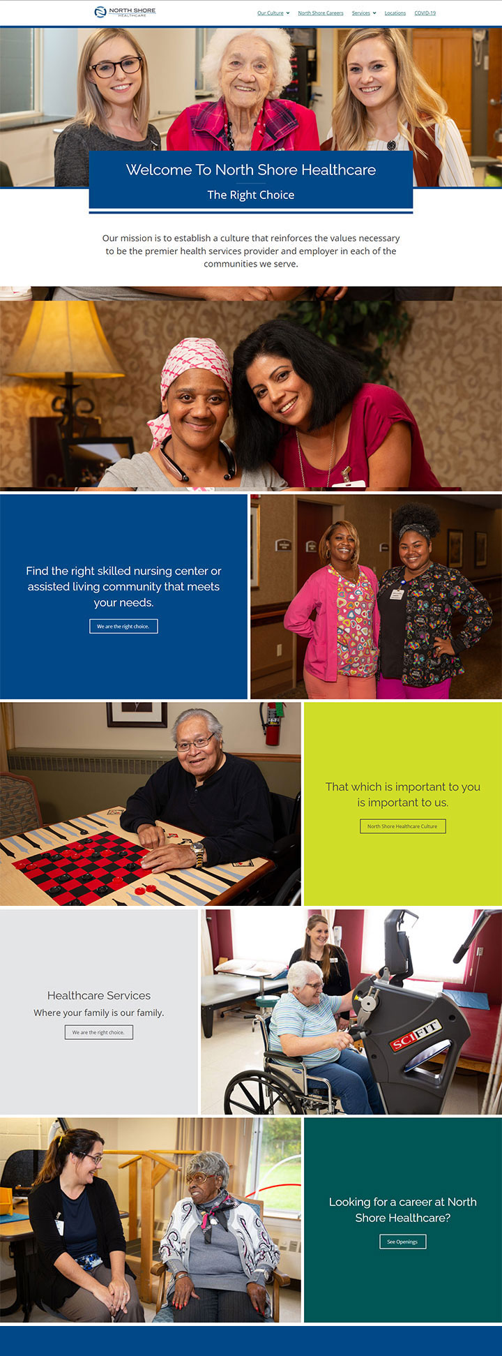
North Shore Healthcare came to Northwoods looking for an accessible website with a contemporary design. They had a lot of custom photography and needed more ways to highlight the images through the site. Each of the 70+ centers had their own dedicated website and North Shore Healthcare was planning on adding more facilities to their roster overtime. North Shore Healthcare was looking to provide users with general information about their core values and mission while also maintaining a focus on the local communities of each facility.
The Solution
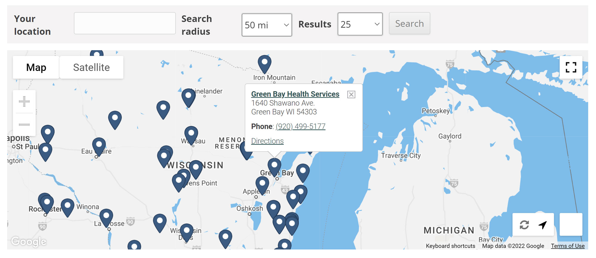
Northwoods consolidated all the facility websites into one and added a location search for users to quickly identify which centers were closest to them. The location search allowed users to search by zip code or address and included an interactive map to help the more visual user identify the location of each center.
Each center had its own dedicated page to present additional information on their services and custom imagery to help validate the quality of care per location. Having all the locations together demonstrates how expansive North Shore Healthcare is, and having pages dedicated to each facility allows users to get a stronger feel for the local community and culture of each location.
The Design
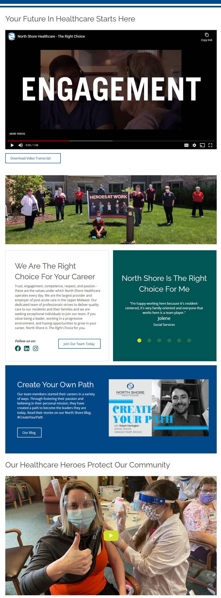
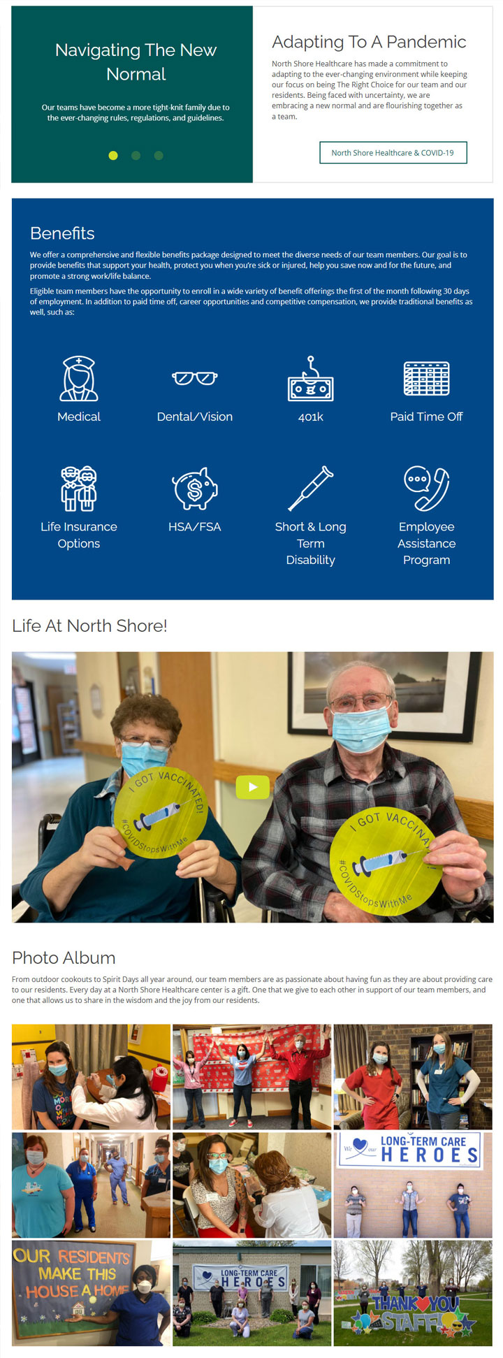
- The beauty of the website’s page layout is its simplicity, which helps the large volume of imagery feel less overwhelming.
- A grid structure is used to provide site administrators flexibility to adapt individual page layouts for pages with a lot of content versus limited content. In addition to providing a good user experience, flexible page layouts help to make the website easier to maintain over time.
- Imagery, colors, and whitespace are also used to help group the content clearly, making it more scannable for users. Information is clearly structured with prominent calls to action clearly identified on each page to keep users moving through the site.
The Outcome
- Downsizing from 71 different domains into one domain saved North Shore Healthcare a significant amount of money. Money saved will now be redirected to other marketing efforts.
- Northwoods continues to provide monthly updates to North Shore Healthcare’s WordPress core and plugins to maintain the website and to protect it from security vulnerabilities.
- More importantly, Northshore Healthcare now has an accessible website designed to meet the needs of all users.
- The North Shore Healthcare website won a Health Care Standard of Excellence award in the 2021 Web Awards, recognizing its ease of use and accessible, user-friendly design.

North Shore Healthcare
North Shore Healthcare has over seventy facilities that offer long-term skilled nursing care, short-term rehabilitation, and assisted living services. They are the largest provider of post-acute care in the Upper Midwest.


The Situation
North Shore Healthcare came to Northwoods looking for an accessible website with a contemporary design. They had a lot of custom photography and needed more ways to highlight the images through the site. Each of the 70+ centers had their own dedicated website and North Shore Healthcare was planning on adding more facilities to their roster overtime. North Shore Healthcare was looking to provide users with general information about their core values and mission while also maintaining a focus on the local communities of each facility.
The Solution
Northwoods consolidated all the facility websites into one and added a location search for users to quickly identify which centers were closest to them. The location search allowed users to search by zip code or address and included an interactive map to help the more visual user identify the location of each center.
Each center had its own dedicated page to present additional information on their services and custom imagery to help validate the quality of care per location. Having all the locations together demonstrates how expansive North Shore Healthcare is, and having pages dedicated to each facility allows users to get a stronger feel for the local community and culture of each location.

The Design
- The beauty of the website’s page layout is its simplicity, which helps the large volume of imagery feel less overwhelming.
- A grid structure is used to provide site administrators flexibility to adapt individual page layouts for pages with a lot of content versus limited content. In addition to providing a good user experience, flexible page layouts help to make the website easier to maintain over time.
- Imagery, colors, and whitespace are also used to help group the content clearly, making it more scannable for users. Information is clearly structured with prominent calls to action clearly identified on each page to keep users moving through the site.
The Outcome
- Downsizing from 71 different domains into one domain saved North Shore Healthcare a significant amount of money. Money saved will now be redirected to other marketing efforts.
- Northwoods continues to provide monthly updates to North Shore Healthcare’s WordPress core and plugins to maintain the website and to protect it from security vulnerabilities.
- More importantly, Northshore Healthcare now has an accessible website designed to meet the needs of all users.
- The North Shore Healthcare website won a Health Care Standard of Excellence award in the 2021 Web Awards, recognizing its ease of use and accessible, user-friendly design.
MetalTek
MetalTek International is a metal casting manufacturing specializing in high temperature, severe wear, and harsh corrosive environments.
The Situation
- MetalTek came to Northwoods with a lot of website content, but that content lacked organization, resulting in user confusion.
- Pages were missing clear calls to action to help users naturally flow through the website.
- The site design also needed a fresh, modern look.
The Solution
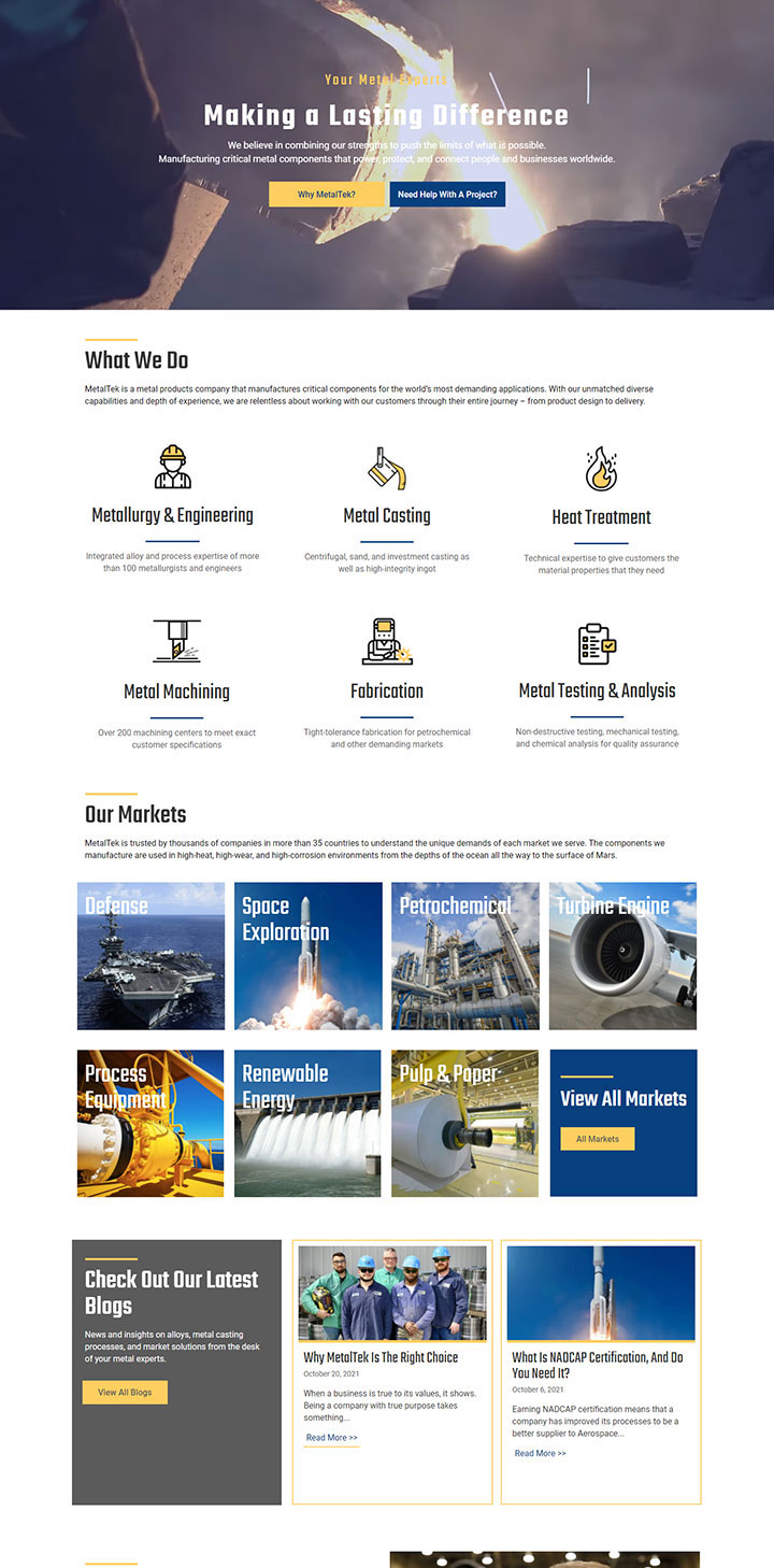
- Northwoods consolidated the site’s information architecture by reducing the number of pages displayed in the utility and main navigation - almost by half. Drop-down navigation was added to help users get to specific content more quickly.
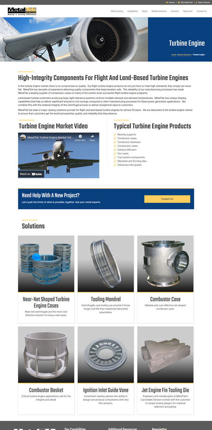
- Page content was given more structure and division to help visitors easily digest it.

The Design
MetalTek’s previous color palette didn’t include royal blue. Instead, it featured grays and yellows. Northwoods designers added a royal blue because of its versatility and ability to inspire trust.
The royal blue also works well with much of their imagery, which already contains blue tones. Adding blue also helps the yellow call to action color stand out more.
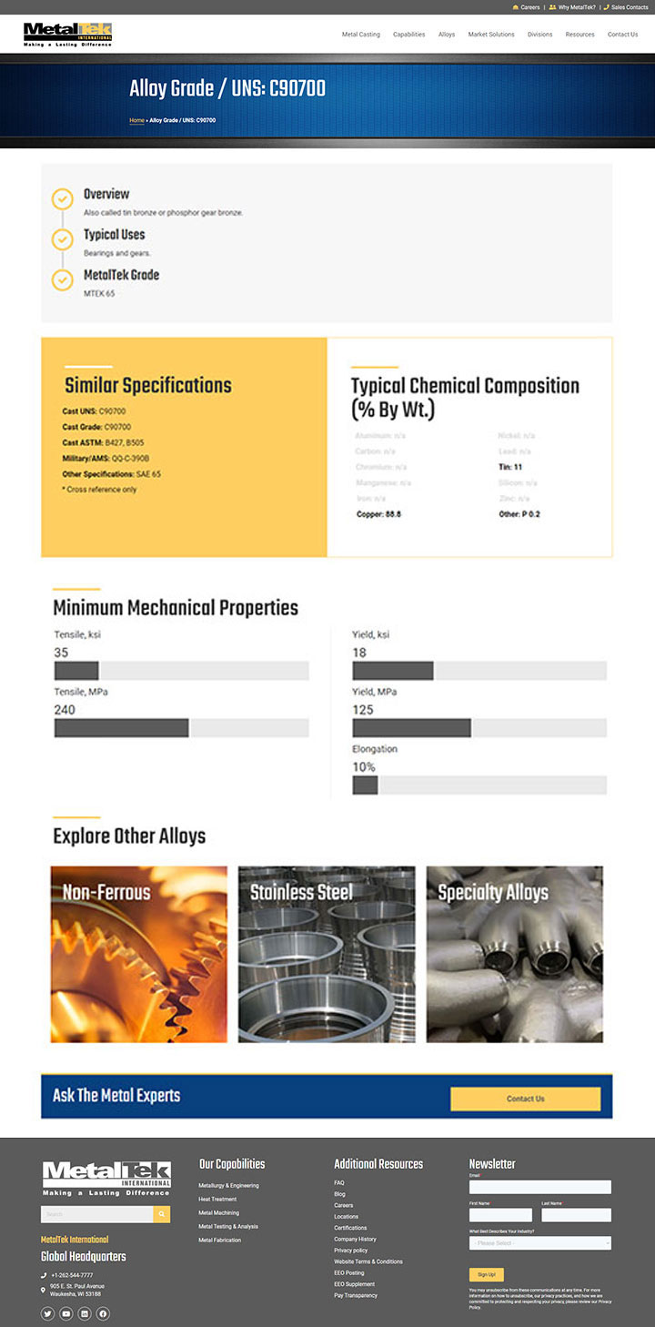
One of the biggest improvements to the site design is the display of complex data. Their alloy data (shown below) is managed in spreadsheets and contains information on chemical composition, product specifications, mechanical properties, and more. Bar counters add movement to the mechanical properties, and color blocking and icons are used to clearly segment different data components. Conditional logic is used to account for data variations, so the design remains intact even when certain data fields are missing.
The Outcome
- MetalTek’s new website design has a much more friendly, approachable aesthetic that makes large amounts of content easier for users to digest.
- Improved content organization, stronger calls to action and an improved user experience has resulted in better user engagement by keeping users moving naturally through the website.

MetalTek
MetalTek International is a metal casting manufacturing specializing in high temperature, severe wear, and harsh corrosive environments.


The Situation
- MetalTek came to Northwoods with a lot of website content, but that content lacked organization, resulting in user confusion.
- Pages were missing clear calls to action to help users naturally flow through the website.
- The site design also needed a fresh, modern look.
The Solution
- Northwoods consolidated the site’s information architecture by reducing the number of pages displayed in the utility and main navigation - almost by half. Drop-down navigation was added to help users get to specific content more quickly.
- Page content was given more structure and division to help visitors easily digest it.

The Design
MetalTek’s previous color palette didn’t include royal blue. Instead, it featured grays and yellows. Northwoods designers added a royal blue because of its versatility and ability to inspire trust.
The royal blue also works well with much of their imagery, which already contains blue tones. Adding blue also helps the yellow call to action color stand out more.
One of the biggest improvements to the site design is the display of complex data. Their alloy data (shown below) is managed in spreadsheets and contains information on chemical composition, product specifications, mechanical properties, and more. Bar counters add movement to the mechanical properties, and color blocking and icons are used to clearly segment different data components. Conditional logic is used to account for data variations, so the design remains intact even when certain data fields are missing.
The Outcome
- MetalTek’s new website design has a much more friendly, approachable aesthetic that makes large amounts of content easier for users to digest.
- Improved content organization, stronger calls to action and an improved user experience has resulted in better user engagement by keeping users moving naturally through the website.
Orley Shabhang
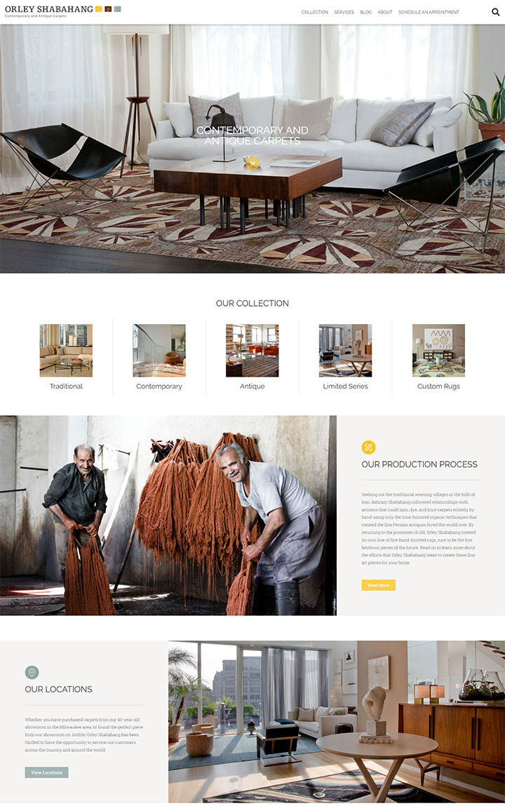
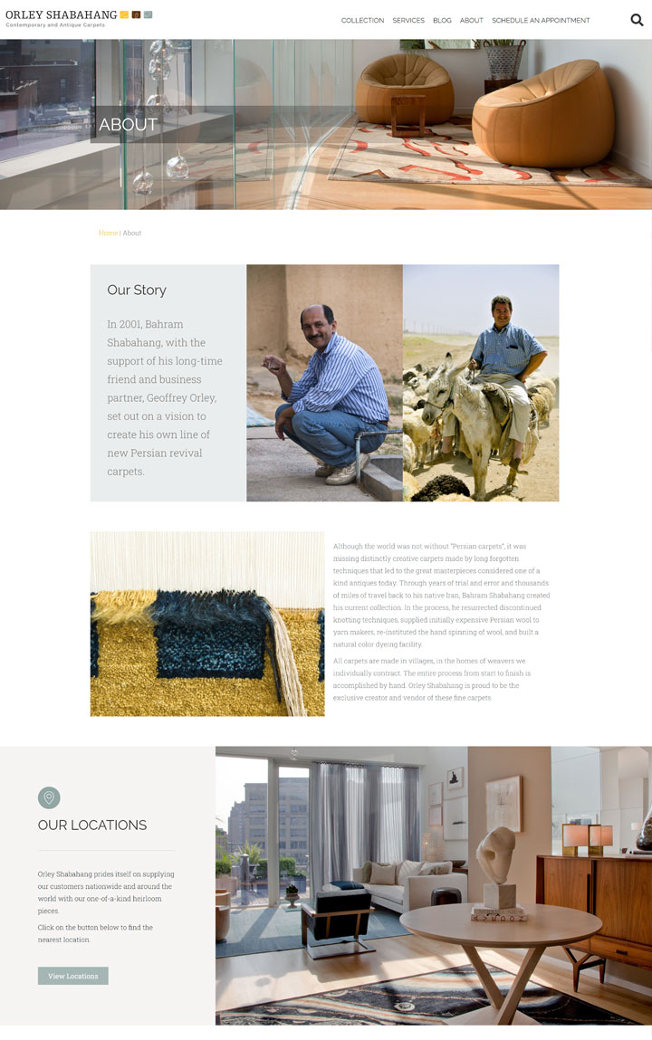
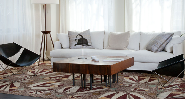
Orley Shabahang is a Milwaukee-based purveyor of contemporary and antique Persian revival carpets. All of Orley Shabahang’s carpets are made 100% by hand in the homes of weavers with whom they contract.
The Situation
- Orley Shabhang was having a difficult time working within the constraints of their previous WordPress website template. Adding new products was extremely difficult, especially because a single product could have up to 14 different variations in size and colors.
- Technical SEO issues, including missing headings, missing alternative text, and very large images, were slowing the website down.
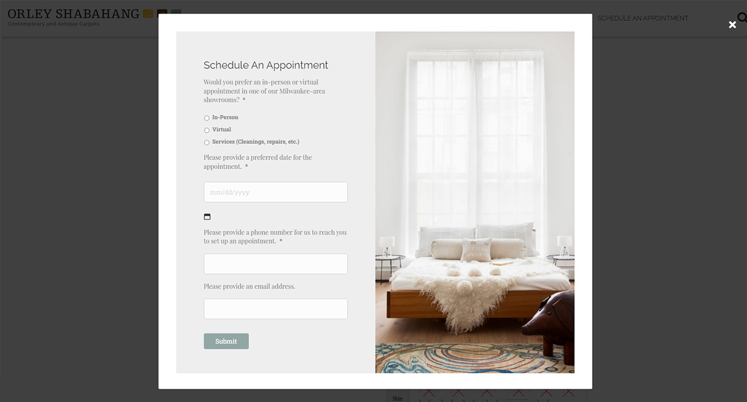
- Most of the product detail pages were also missing strong calls to action (CTAs) to prompt visitors to reach out and schedule appointments.
The Solution
- Northwoods transitioned the Orley Shabahang website to a more flexible WordPress page builder tool, called Beaver Builder, that works well with WooCommerce plugins for product management.
- Beaver Builder helps the team easily manage general content pages while WooCommerce drives online product display, allowing for all necessary product properties, such as sizes, colors, images, and other data, to be effectively managed and maintained on the back end for seamless user-facing display.
The Design
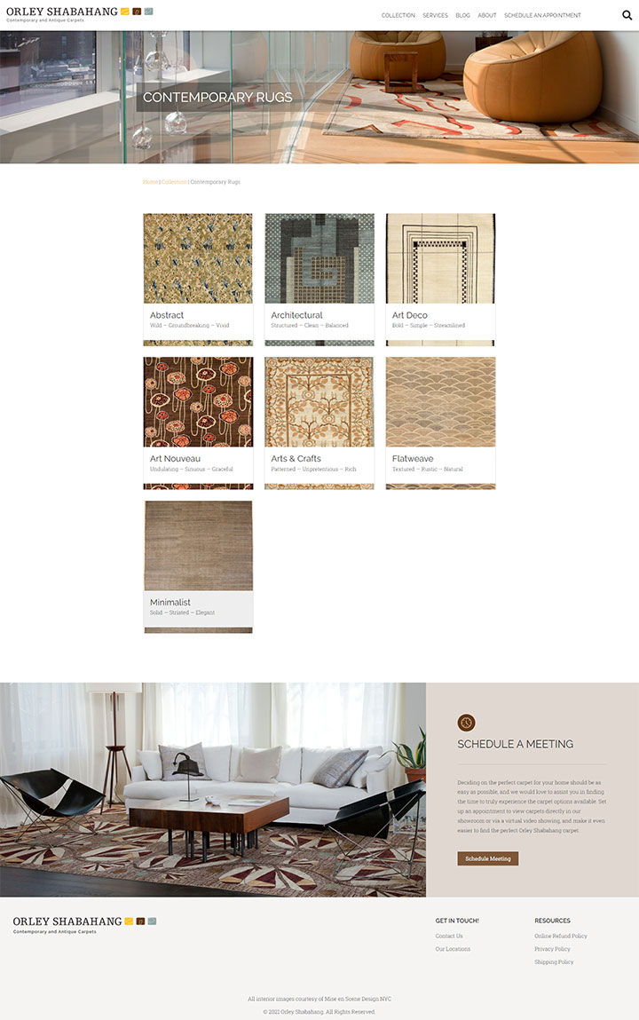
Orley Shabahang’s site purposefully omits any unnecessary features. The minimalist, clean design ensures that the content and imagery are the primary focus. The site colors work well with the brand without being overpowering and help users focus on the right areas.
Plenty of whitespace is used throughout the website to create an organized look and feel.
All product images are of the highest quality, allowing users to zoom in with full clarity to better view the intricate, detailed design of each rug. Each image also contains a short but informative product description that accurately describes the rug with specifications listed below. This quickly provides the user with all the information they need to make an informed purchasing decision. However, if they have more detailed questions, a “contact us” button has been added at the bottom of each page.
The Outcome
- In addition to the elegant new design, the Orley Shabahang team is amazed by how easily and quickly they can add a product to their website.
- The layout of the product detail pages makes it easy for a site visitor to make an informed purchasing decision.
- While Orley Shabahang’s catalog is currently limited, they plan to add many more products. Fortunately, with their new website and easy management tools, adding products is easy to do and positions them perfectly to offer full e-commerce capabilities in the future.
Orley Shabhang
Orley Shabahang is a Milwaukee-based purveyor of contemporary and antique Persian revival carpets. All of Orley Shabahang’s carpets are made 100% by hand in the homes of weavers with whom they contract.


The Situation
- Orley Shabhang was having a difficult time working within the constraints of their previous WordPress website template. Adding new products was extremely difficult, especially because a single product could have up to 14 different variations in size and colors.
- Technical SEO issues, including missing headings, missing alternative text, and very large images, were slowing the website down.
- Most of the product detail pages were also missing strong calls to action (CTAs) to prompt visitors to reach out and schedule appointments.
The Solution
- Northwoods transitioned the Orley Shabahang website to a more flexible WordPress page builder tool, called Beaver Builder, that works well with WooCommerce plugins for product management.
- Beaver Builder helps the team easily manage general content pages while WooCommerce drives online product display, allowing for all necessary product properties, such as sizes, colors, images, and other data, to be effectively managed and maintained on the back end for seamless user-facing display.

The Design
Orley Shabahang’s site purposefully omits any unnecessary features. The minimalist, clean design ensures that the content and imagery are the primary focus. The site colors work well with the brand without being overpowering and help users focus on the right areas.
Plenty of whitespace is used throughout the website to create an organized look and feel.
All product images are of the highest quality, allowing users to zoom in with full clarity to better view the intricate, detailed design of each rug. Each image also contains a short but informative product description that accurately describes the rug with specifications listed below. This quickly provides the user with all the information they need to make an informed purchasing decision. However, if they have more detailed questions, a “contact us” button has been added at the bottom of each page.
The Outcome
- In addition to the elegant new design, the Orley Shabahang team is amazed by how easily and quickly they can add a product to their website.
- The layout of the product detail pages makes it easy for a site visitor to make an informed purchasing decision.
- While Orley Shabahang’s catalog is currently limited, they plan to add many more products. Fortunately, with their new website and easy management tools, adding products is easy to do and positions them perfectly to offer full e-commerce capabilities in the future.
Our WordPress Websites Are:
Worry-free
User-friendly
Beautifully designed
Easy to update and maintain
Effective
Secure
Affordable
Supported monthly

Let's Get Started
Whether you need a brand new website, a website redesign, or have a WordPress mess on your hands that needs fixing, fast … we can help.