North Shore Healthcare
North Shore Healthcare has over seventy facilities that offer long-term skilled nursing care, short-term rehabilitation, and assisted living services. They are the largest provider of post-acute care in the Upper Midwest.
The Situation
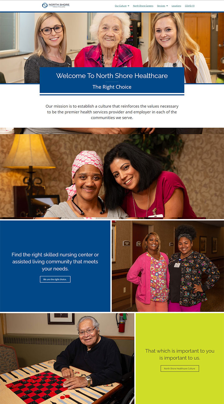
North Shore Healthcare came to Northwoods looking for an accessible website with a contemporary design. They had a lot of custom photography and needed more ways to highlight the images through the site. Each of the 70+ centers had their own dedicated website and North Shore Healthcare was planning on adding more facilities to their roster overtime. North Shore Healthcare was looking to provide users with general information about their core values and mission while also maintaining a focus on the local communities of each facility.
The Solution
Northwoods consolidated all the facility websites into one and added a location search for users to quickly identify which centers were closest to them. The location search allowed users to search by zip code or address and included an interactive map to help the more visual user identify the location of each center.
Each center had its own dedicated page to present additional information on their services and custom imagery to help validate the quality of care per location. Having all the locations together demonstrates how expansive North Shore Healthcare is, and having pages dedicated to each facility allows users to get a stronger feel for the local community and culture of each location.


The Design
- The beauty of the website’s page layout is its simplicity, which helps the large volume of imagery feel less overwhelming.
- A grid structure is used to provide site administrators flexibility to adapt individual page layouts for pages with a lot of content versus limited content. In addition to providing a good user experience, flexible page layouts help to make the website easier to maintain over time.
- Imagery, colors, and whitespace are also used to help group the content clearly, making it more scannable for users. Information is clearly structured with prominent calls to action clearly identified on each page to keep users moving through the site.
- The site also features many interactive components, such as videos, sliding testimonials, and photo galleries to keep users more engaged. The design was created with accessibility in mind, which involves much more than just making sure color contrast requirements are being met. It also includes strong hover effects involving more than a simple color change, ensuring interactive elements are easy to identify, adding clear labels and instructions to forms, using transcripts to accompany videos, following proper heading structure, and more to ensure that the site and its content are accessible to people with various disabilities.